What Are the Top 10 Event Directional Banner Types?

Event signs do more than point the way. They help guests move confidently through busy entrances, exhibition halls, outdoor venues, and crowded festival grounds. A well-placed Event Directional Banner can reduce confusion, guide visitors toward key areas, and make an event feel more organized from the moment they arrive.

The right banner depends on the venue, audience, and message. Entrance banners welcome attendees, while aisle signs and overhead banners help people navigate large spaces. Outdoor events may need sturdy, weather-conscious options, and temporary indoor setups often benefit from lightweight, easy-to-position displays. Details matter: readable lettering, strong contrast, clear arrows, and placement at eye level can make directions easier to follow. A beautiful design is not enough.

This guide explores ten common event directional banner types, from freestanding signs to hanging and fence-mounted options. It considers where each format works best, what practical details to check, and how to match a banner to the flow of an event. These are useful starting points, not universal rules. A sign that works in a quiet conference venue may disappear in a noisy, crowded lobby. Sometimes the simplest banner is the most effective. Careful planning can help organizers choose signs that are visible, understandable, and suited to the setting—though even a thoughtful layout may need adjustment once guests begin moving through the space.
What Are the Top 10 Event Directional Banner Types?

What Event Directional Banners Are and How They Guide Visitors

Event directional banners are large, readable signs that help visitors move through a busy venue. They answer practical questions before staff members need to intervene. A clear arrow can reduce hesitation near an entrance, hallway, or crowded registration desk.

The top ten types include entrance banners, registration banners, parking banners, restroom banners, session-room banners, stage-direction banners, dining-area banners, exhibitor-hall banners, accessibility banners, and emergency-exit banners. Each type should use a short message, strong contrast, and an arrow that remains visible from several steps away. I have found that visitors often follow the arrow first and read the words second. Placement matters just as much. A banner hidden behind a display table has little value, even if its design looks polished.

Use consistent colors for related destinations. Keep key information at eye level. Test every sign from a visitor’s actual walking path.

This exposes problems that look invisible during planning. For example, a directional arrow may point correctly from one angle but appear reversed from another. That mistake is easy to make. It is also costly during peak arrival times.

Reliable wayfinding includes more than printed banners. Staff should know the same routes, especially for accessible entrances and crowded areas. Weather-resistant materials suit outdoor parking zones, while lightweight indoor banners work well in corridors. Review visitor movement after the event. Some signs may have guided people efficiently, but others may have created unnecessary turns. That feedback should shape the next layout.

Key Criteria for Comparing Directional Banner Types

What Are the Top 10 Event Directional Banner Types?

Key Criteria for Comparing Directional Banner Types

Choosing an event directional banner starts with the route, not the material. Compare visibility from the expected viewing distance, message capacity, placement height, and whether guests approach from one direction or several. A tall freestanding banner can guide people across an open hall, while a hanging sign may work better above a crowded aisle. Keep wording brief: “Registration →” is easier to scan than a full sentence. Test the design at actual size. Small text often looks readable on a laptop but disappears beneath venue lighting.

Durability and setup matter, too. Fabric is lightweight and packs easily; rigid panels can hold their shape in busy entrances. Check whether a banner needs a weighted base, tools, or a second person to install.

The Federal Highway Administration’s 2009 sign research found that drivers’ recognition of traffic signs varied with viewing conditions, including distance and visual complexity. Event guests are not drivers, but the principle still applies: clutter and poor sightlines weaken recognition.

A 2012 FedEx Office survey reported that 76% of consumers had entered a store they had not visited before because of its sign. That is retail evidence, not event-specific proof. Still, it supports treating signage as a practical navigation tool, not decoration. I would compare legibility on site, though this step is often skipped.

Ten Common Event Directional Banner Types and Their Uses

Event direction works best when each sign answers one question at a glance.

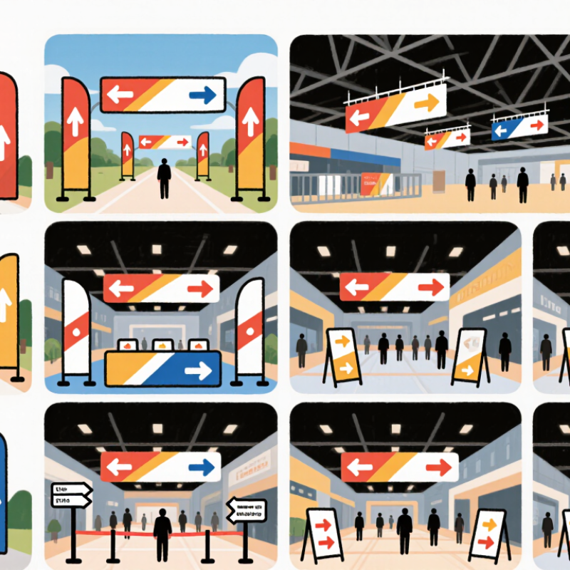
Freestanding banners guide guests through lobbies and registration areas, while retractable banners suit temporary queues and can be moved between sessions.

Hanging banners point toward halls from a distance, especially where crowds block eye-level signs. Wall-mounted banners mark entrances, restrooms, or quiet rooms.

Clear arrows matter. Keep wording short, and check sightlines from a guest’s actual approach.

Outdoor and specialized spaces need different formats.

Fence-mounted mesh banners can direct visitors along open-air routes while allowing wind to pass through. Pole banners identify paths or event zones across a campus.

Double-sided banners help people approaching from either direction. Tabletop signs guide guests at check-in desks, though they can disappear behind brochures.

Floor graphics mark turns or waiting lines, but only work on clean, suitable surfaces. Fabric banners add a softer look for indoor corridors and can carry large directional labels.

These ten types solve different problems; none fixes confusing layout on its own.

Walk the route before printing. A sign that seems obvious on a plan may be hidden by a doorway, glare, or a tall display.

Some details are easy to miss.

How to Match Banner Types to Event Layouts and Visitor Needs

Event direction works best when each banner fits its location and the visitor’s next decision. Freestanding signs suit entrances and queue turns, while overhead banners help people spot destinations across a crowded hall. Wall-mounted panels guide visitors along corridors without narrowing the walking path. Retractable banners work well near registration desks, but can be hard to see from behind a crowd. Pole banners, feather flags, fence banners, suspended signs, tabletop signs, and floor graphics each serve a more specific setting. Use floor graphics only where surfaces are suitable and the route remains clear. Small details matter.

Tips: Stand where visitors will approach from. Check sightlines at busy times, not only in an empty venue. Keep arrows large, wording brief, and contrast strong. Place signs before a turn, not after it.

Match the format to visitor needs, too. First-time guests may need clear, repeated directions from parking to check-in. Families and visitors carrying bags benefit from signs placed at eye level and away from tight corners. At a large conference, overhead signs can mark zones, with freestanding signs handling room-level directions. Outdoors, secure flags and pole banners against wind, and check that they remain readable in changing light. Even a well-planned route can confuse people when signs use different terms for the same place. That is easy to miss during setup. Walk the route as a guest would, and revise any point where the next step feels uncertain.

Placement, Visibility, and Safety Considerations

Directional banners work best when placed where visitors naturally pause or change direction. A freestanding sign near an entrance can point toward registration, while a hanging banner helps people spot a hall from across a busy lobby. Fence-mounted banners suit outdoor queues, and smaller signs can guide guests through corridors. Choose the format for the location, not just its appearance. A large banner may look clear in an empty room but disappear behind a crowd.

Visibility depends on height, contrast, lighting, and viewing distance. Keep arrows and destination names large enough to read before people reach a turn. Test the wording from several steps away, and check whether tables, open doors, or stage equipment block the view. At night, inspect outdoor signs under actual event lighting. Small details matter. A sign facing the wrong approach can send people past the correct entrance.

Safety deserves equal attention. Secure stands against wind and accidental bumps, and keep banner bases out of accessible routes and emergency exits. Avoid hanging signs where they could obstruct sprinklers, lights, or sightlines. For floor graphics, use a slip-resistant surface and place them away from wet thresholds. I have seen a tidy-looking sign create a bottleneck when it narrowed a doorway. That choice needs rethinking: clear directions should guide movement without forcing people into a hazard.

Scroll to Top